
guangmin leng 冷广敏|深入研究
China
1. Artist Profile
冷广敏1986年生于山东青州,2009年毕业于天津美术学院造型学院油画专业第三工作室,2012年获该专业硕士学位,现工作、生活于北京。学院油画训练赋予他对造型、色层与画面秩序的敏锐控制,但其创作并未停留在以笔触塑造形象的传统路径,而是较早将“切割”发展为核心方法:切割既改变画面表层的连续性,也使绘画获得近乎物理性的内部空间。其早期至2010年代中期的作品,多从可辨识的物象、日常景观或局部形态出发,通过平面化、分割、遮蔽与重组,削弱叙事的完整性,使形象处于具象与抽象之间。2013年个展《看见表象》及其后持续的展览实践,标志着他逐渐以表面、结构和观看关系取代对单一题材的依赖。 2010年代后期是其语言进一步转折的阶段。冷广敏不再仅将切割理解为图像处理,而是将其转化为秩序被建立、扰乱和重新生成的过程;画面中的色块、硬边、渐变、刮痕与负形彼此牵制,形成既有精确结构又包含偶发痕迹的视觉场。2019年前后的作品开始使用喷漆等辅助媒介,以透明、覆盖、流动或雾化的不同表面效果扩展油画的质感层次,显示出他由“描绘对象”转向“组织材料感知”的明确方向。近年的创作则更强调壳、伤口、光、迁徙、雾与景观等意象的悬置状态:它们并非文学叙事的说明物,而是触发色彩关系、空间深度与触觉联想的结构性媒介。 在中国“后80后”绘画的语境中,冷广敏的重要性在于,他避免以直接的社会图像或身份叙事作为绘画的主要支点,而以个人化、非再现性的方式回应经验世界中秩序与失序、自然与人工、平整与破损之间的张力。他的主要领域仍是架上绘画,但其工作方式已越出单一油画媒材的边界:材料在此不是附加装饰,而是决定图像如何显现、如何被遮蔽和如何产生空间错觉的构成力量。对于综合材料艺术研究而言,冷广敏提供了一个重要案例:综合材料未必意味着媒介的堆叠,而可以发生在绘画内部,通过切、刮、喷、覆等工艺对表面结构的持续改造,使材料、手法、色彩与观念共同生成开放而不稳定的视觉秩序。
2. Artistic Concepts
冷广敏的艺术观念始终围绕一个基本问题展开:绘画如何不再只是再现对象的窗口,而成为拆解、遮蔽、重组对象的现场。他早年接受油画训练时,已对传统笔触所携带的抒情性和“手工表现”保持警惕;这使他没有把油画视为自然主义观看的延伸,而是将其当作可以被重新组织的物质平面。日常物品、植物、器物或人体形象在其作品中并非叙事主角,而更像一套可供提取的边缘线、结构线和轮廓关系。对象因此被降为构图的触发器:衬衫不再关乎衣物本身,而提供折线与分区;果实、鸟群或景观也不以象征意义取胜,而承担着切分色块、调度轻重、制造空间错觉的功能。由此,他的绘画既保留可辨识的物象,又不断将其推向抽象结构。 这一观念形成于他对“物质性”的反复试探之中。早期创作曾借助厚重肌理、现成物形态以及重复性手工劳动,考察材料如何脱离原有功能而形成新的表皮和能量。钉子、木材等材料的累积,使重复不只是形式母题,也成为关于时间、身体耐力与量变的实践:工业性的金属与自然性的木质相互嵌入,产生近似生物皮肤的陌生触感。此后,他逐步将对材料的兴趣集中于架上绘画内部,以纸张拼贴、覆盖、切割、刮擦和喷涂等方式,使画面同时呈现平整与破损、轻薄与硬质、表层与深处。材料并非为了增加装饰性,而是直接参与观看机制:纸的边缘、切口的阴影和不同媒介的反光,都迫使观者意识到图像并不稳定,而是由层层遮蔽构成。 “切割”是冷广敏最具辨识度的方法,也是其观念的核心动作。它不同于单纯的几何化处理:切割一方面打断既有图像的完整性,拒绝图像以单一故事或既定意义被消费;另一方面又以硬边、负形、裂隙和叠层重新建立秩序。于是,画面中的空间并非透视法制造的深度,而是由断裂、覆盖和色块冲突所暗示的心理性深度。红与绿、冷与暖、暗面与高光之间的对抗,和材料表面的平滑、磨损、刮痕相互呼应,使视觉结构始终处在生成与瓦解之间。这种张力也说明他关注的并不是稳定的“形式美”,而是事物从有序滑向无序、又被绘画暂时收束的过程。 2019年前后,他更明确地将这一过程理解为秩序与熵增之间的关系,画面开始加强流动、透明、渗透等叙事线索,并尝试以喷漆调节质感和造型。相较于早期更强调对象结构的分析,这一阶段的作品使形式语言与情境暗示彼此贴近:色彩不再只是平面分区,也成为能量移动的媒介。近年的创作则进一步转向图像的“外壳”。他借用古典人物、艺术史图像或常见物象,却以统一色调、几何切面和拼贴关系将其转译为仿佛金属薄壳般的表面。图像在这里既可被辨认,又始终隔着一层距离;艺术史不被直接引用为知识对象,而成为可重新编码的视觉材料。 因此,冷广敏的作品并非从抽象走向具象,或从具象退回抽象的线性变化,而是在两者之间不断往返。他强调硬边并非预设的风格标签,而是切割、拼接和材料处理所留下的结果;图像的增加,也不是回到叙事绘画,而是为切割提供更复杂的结构资源。其个人经验所对应的,是图像高度流通、现实经验不断被屏幕化和碎片化的当代环境。面对这一环境,他并不以宏大主题概括现实,而以冷静、节制而持续的制作,将日常可见之物转化为关于观看、表面、秩序与不确定性的绘画实验。
3. Main Materials, Manufacturing Processes, and Technologies
冷广敏的创作以布面丙烯、纸张及多种综合材料为基本媒介,并在部分早期实践中使用大量钉子形成密集表面。他选择这些材料,并非为了扩充“材料效果”,而是看重其能够同时承担覆盖、显露、切开、堆积与阻隔等相互矛盾的物理功能。亚麻布具有稳定的经纬结构和足够的承载力,既能容纳纸张的粘贴与颜料层的叠加,也能经受反复刮刻;纸张纤维较为松软、吸附性强,与丙烯颜料干燥后形成的平整、坚硬而略带塑料感的膜层相遇,便天然构成软硬、内外、表皮与基底之间的差异。艺术家通常先在布面建立纸质层或综合色层,再以丙烯组织色块、形象和空间关系,最后用刀具切割、刮除或剔刻局部颜料,使被遮蔽的纸层、底色及边缘重新暴露。切割并不只是破坏性的动作:刀口将原本连续的绘画表面转化为具有深浅、阴影和触觉暗示的结构,平面因此获得近似浮雕的厚度,图像也在显现与隐没之间保持不稳定状态。 这种工艺尤其重视边界的控制。冷广敏并不以自由挥洒的笔触制造表现性,而多以硬边色面、刮痕、裂口、负形和局部渐变来调度视觉张力;综合色块的封闭性越强,刀痕所造成的穿透感便越明确。钉子所形成的重复性密集表面,则把单一物件转化为类似皮肤、鳞片或人工组织的视觉单元,使数量、劳作时间与物质触感共同进入画面。由粘贴、覆盖到切开、剥露的连续程序,使他的绘画不再只是再现对象,而成为对物象外壳、图像秩序及观看习惯的拆解。材料所保留的伤口、层次和阻力,最终构成一种介于绘画、拼贴与浅浮雕之间的语言:表面看似冷静、精确,内部却持续暴露出对抗、破坏与重组的过程。
4. A Detailed Examination and Analysis of 10 Representative Works
Work 01
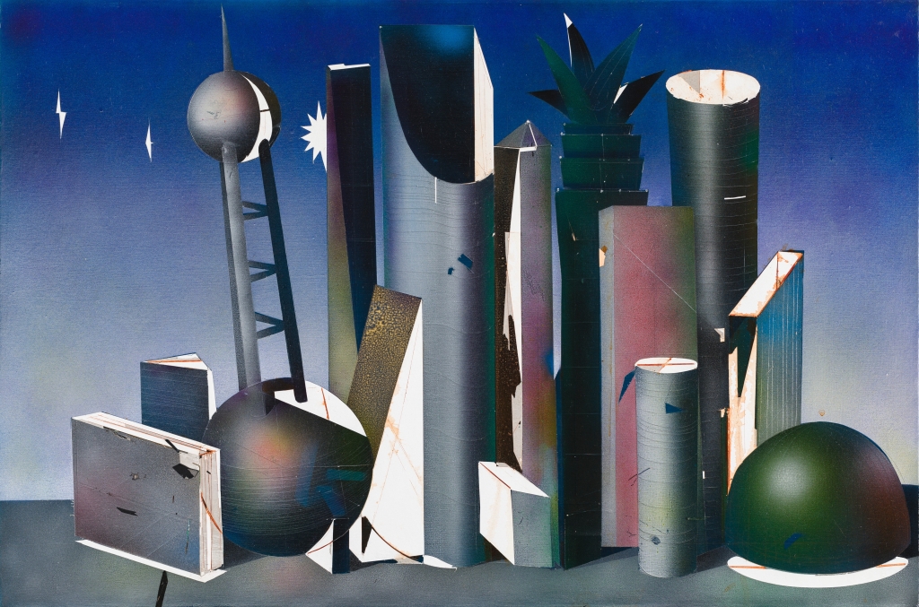
The composition consists of a group of highly abstracted three-dimensional elements that form a still-life scene resembling a “complex of buildings.”The background, ranging from deep blue to gray-blue, and the low, level ground compress the space into a stage with no clear vanishing point. A dense cluster of cylinders, semicircles, rectangles, pointed cones, slanted panels, and spheres near the central axis creates a rhythmic pattern that transitions from high to low and from vertical to diagonal.The spherical element on the elevated platform on the left echoes the heavy hemisphere in the lower right, achieving a balance of weight within the composition’s asymmetry; the towering, arched column in the center serves as a visual axis, unifying the sharp and fragmented forms around it. Color does not serve to represent objects but is used to distinguish volume, light direction, and structural relationships. Cool gray, blue-black, and dark green form the work’s cool tonal foundation, while localized white cross-sections, pink-purple transitions, and narrow orange-red lines create flashes reminiscent of light sources.White is not merely a highlight; it frequently appears at cut edges, borders, and fractures, transforming flat surfaces into sharp geometric cross-sections; within the dark areas, gradients enhance the sense of volume in cylinders, spheres, and concave arcs.The subtle differences between warm and cool colors are not used for lyrical expression, but rather as precise tools for organizing spatial depth and the interplay of forms that obscure one another. Visible on the surface of the images are fine horizontal textures, scratch marks, mottled grains, and localized variations in the evenness of the coating.Certain columns bear parallel lines that are almost mechanically repetitive, seeming to hint at a production logic of coiling, stacking, or lamination; several white surfaces retain scratches, cracks, and stains, lending a sense of temporal wear to the otherwise overly pristine geometric structures.The juxtaposition of rigid edges, softened gradients, and occasional traces of damage reveals that the artist does not treat material effects as mere decoration, but rather allows “composition” and “wear” to coexist. The significance of this work lies in its compression of painterly chiaroscuro, a sense of texture reminiscent of mixed media, and sculptural structural thinking onto a single plane. The forms appear constructible, yet are dissolved into images by light, shadow, and the background; they resemble modern cities, machinery, or futuristic ruins, yet consistently resist fixed narratives.Combined with Leng Guangmin’s consistent focus on abstract structures, materiality, and rational order, this work can be understood as a method of rearranging the perception of reality through geometric units: the rigorous structure provides order, while the surface marks constantly disrupt that order, endowing the austere form with a complex and subtle spiritual tension.
Work 02
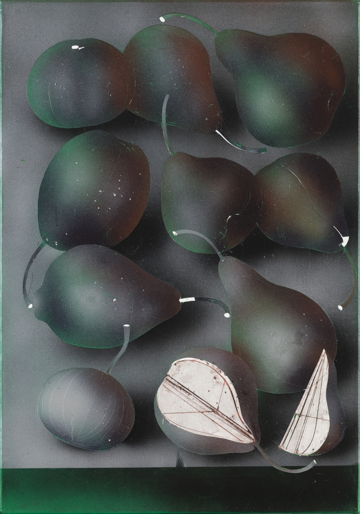
The composition frames a group of fruit-like organic forms within a vertical, box-like rectangular space. Rather than adhering to the table-top perspective common in still life paintings, the forms appear to be laid flat, suspended, or slowly stacked against a deep gray background;The occlusions, overlaps, and dark gaps between the forms create an interior space that is both crowded and weightless. The fruit outlines in the upper and middle sections are plump and slightly distorted, with slender, curved stems interweaving among them, transforming the individual clusters from a simple arrangement into an interconnected network.The two forms at the bottom—which have been cut open or exposed—are particularly crucial: their bright, light-colored interiors suddenly break through the overall gloom, revealing reddish-brown lines resembling leaf veins, cross-sections, or hand-drawn structural diagrams. The color palette is primarily built upon black, gray, dark green, and dark brown.The surface of the fruit peel is not flatly painted; rather, soft transitions between light and shadow create a volume resembling a velvety, waxy, or translucent skin; a cool green glow seeps out from the edges in places, while dark red lurks in the shadows and at the transitions, allowing a sense of the natural object’s ripeness to coexist with a slight sense of decay.The gray-black background suppresses environmental details, so that color does not serve a realistic light source but becomes a means of regulating psychological temperature and spatial depth. Fine white dots, scratches, smudges, and an uneven grain are visible on the surface. These elements diminish the illusion of smoothness in the forms and preserve the serendipity of the creative process within the painting.If the softened layers result from spraying, glazing, or repeated abrasion, then the fine lines, white breaks, and brown outlines of the incised sections form a contrasting action, one that approaches engraving and delineation.These two types of traces are in tension with one another: the former creates a skin-like richness and silence, while the latter—resembling cracks, markings, or anatomical records—brings the internal structure into view. This treatment ensures that the fruit is more than just a still-life motif.The juxtaposition of the enclosed, intact shell and the revealed internal patterns prompts the viewer to oscillate between sensory allure, vitality, and structural analysis.Combined with Leng Guangmin’s focus—as a mixed-media artist—on the surface of images, material traces, and the sense of time, this work may not intend to reproduce a specific fruit, but rather, through recognizable natural forms, examines how “growth” is transformed into a visual process of layering, wear, incision, and重组.
Work 03
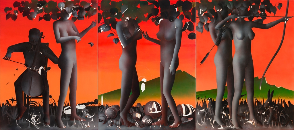
The composition unfolds across a vertical triptych; the narrow white spaces between the panels not only delineate sections but also impart a sense of discontinuity to the originally continuous scene, reminiscent of a stage set or narrative montage.The background features a downward gradient from highly saturated vermilion and orange-red; the gentle green hills in the distance contrast with the blackish-gray grass in the foreground, creating a dual juxtaposition of warm and cool tones as well as light and dark. Above, dense clusters of dark foliage spread horizontally, obscuring the heads of several figures;this treatment makes the body the primary unit of identification, transforming the figures in the composition from specific portraits into anonymous, allegorical characters. The figure holding a cello on the left, the nude figure standing opposite in the center, and the figure drawing a bow on the right collectively form a series of action fragments that are difficult to connect.Playing, touching, gazing, and archery should point toward communication or expression, but with their heads obscured by the shadows of the leaves, the relationships between the figures are left suspended. Bodies scattered across the ground, mask-like circular objects, and fragments of birds, beasts, or artifacts disrupt the stability of the upright human form through their horizontal positions, stacking, and localized highlights;they resemble both narrative remnants and reinforce an atmosphere where growth, desire, injury, and death are intertwined. The figures’ skin is rendered in soft gradations of gray-black and brown-gray; their edges do not rely entirely on hard outlines but achieve a sculptural volume through subtle transitions of light and shadow.In contrast, the outlines of branches, foliage, and musical instruments are sharper, with occasional white cut lines, reflective negative spaces, and near-silhouette-like blocks.The smooth background color field, the mist-like shadows cast by the human figures, and the dense silhouettes of plants create a juxtaposition of different textures: the former creates an unreal, bright space, while the latter two evoke a sense of oppression, obscurity, and tactile stickiness.The visible techniques in the painting demonstrate control over gradients, masking, layering, and precise boundaries, allowing the work to retain traces of manual shaping while also possessing a clear, collage-like structure. This work continues the surrealist compositional approach common in Leng Guangmin’s imagery: rather than explaining the figures through a linear narrative, it activates the viewer’s perception through the imbalanced scales and relationships between bodies, natural elements, and objects.The red background is not merely decorative; rather, it thrusts the black branches and leaves, the gray flesh, and the green slopes into a stark visual conflict; the split-screen composition further prevents meaning from being easily synthesized. Thus, color, the obscuring of the body, and the theatrical space collectively constitute a visual theater situated between desire, ritual, and hidden psychology.
Work 04
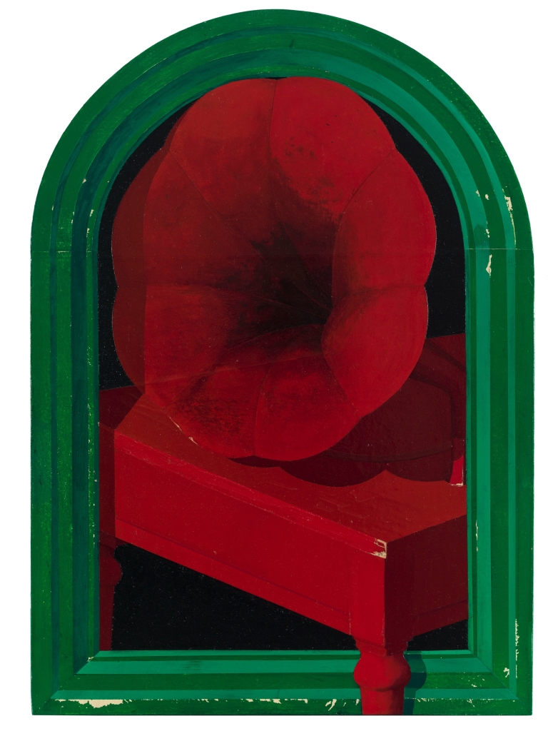
The composition establishes an enclosed space—reminiscent of a storefront window, a niche, or a stage entrance—defined by an arched green border. The border consists of several parallel layers of green bands that recede inward, emphasizing its depth while drawing the viewer’s gaze toward the central red subject.The central form features a trumpet-shaped, spiraling silhouette: its upper section is bulbous with undulating edges, while its interior creates a dynamic convergence toward the center through curved divisions and deep, dark shadows; the lower section, meanwhile, connects to a red pedestal rendered with clear perspective.It exists somewhere between an object, a body part, and an abstract volume; thus, it does not offer a stable means of identification but instead engages the viewer through its ambiguous form. The color relationship is built on a high-density juxtaposition of red and green. The cool green of the outer frame is not applied uniformly; alternating bands of varying depths give it a sense of layering and envelopment;the red within gradually deepens from a brighter vermilion into wine red, brownish red, and near-black shadows. Although the red form occupies the largest area, it is not light or eye-catching; rather, due to the extensive dark tones, overlapping translucent layers, and internal black fissures, it exudes a compressed, accumulated weight.The nearly black background severs the connection between the main subject and the space behind it, making the red form appear as if imprisoned within the frame, while the slanted edge of the pedestal serves as one of the few clear spatial cues in the composition. The surface shows signs of wear, scuffs, tiny spots, and localized color loss; in particular, the damage along the green border and the edges of the pedestal disrupts the orderly geometric structure.The red areas also reveal color variations resulting from layers of overpainting, wiping, or light glazing; the contours are not defined by a single, hard edge but gradually emerge through gradations of deep red. These traces allow the painting to retain the manual process of drawing or application while acquiring a sense of time akin to the patina of an antique.The disciplinary nature of the frame, the object-like quality of the pedestal, and the soft, expansive contours of the subject clash with one another: the rigid structure constrains the organic form, while the organic form, with its sense of spiraling and expansion, undermines the stability of the structure. In light of Leng Guangmin’s ongoing exploration of the transformation between imagery, materiality, and psychological space, this work can be understood as a re-arrangement of the “visible.”Rather than relying on narrative explanation, it allows the clash of colors, the oppressive effect of frames within frames, the erosion of the surface, and the unnameable forms to collectively create a sense of perceptual uncertainty. The work’s value lies in juxtaposing highly decorative colors with an almost somber mood, causing the viewer to hover between the recognition of the object and an inner sense of feeling.
Work 05
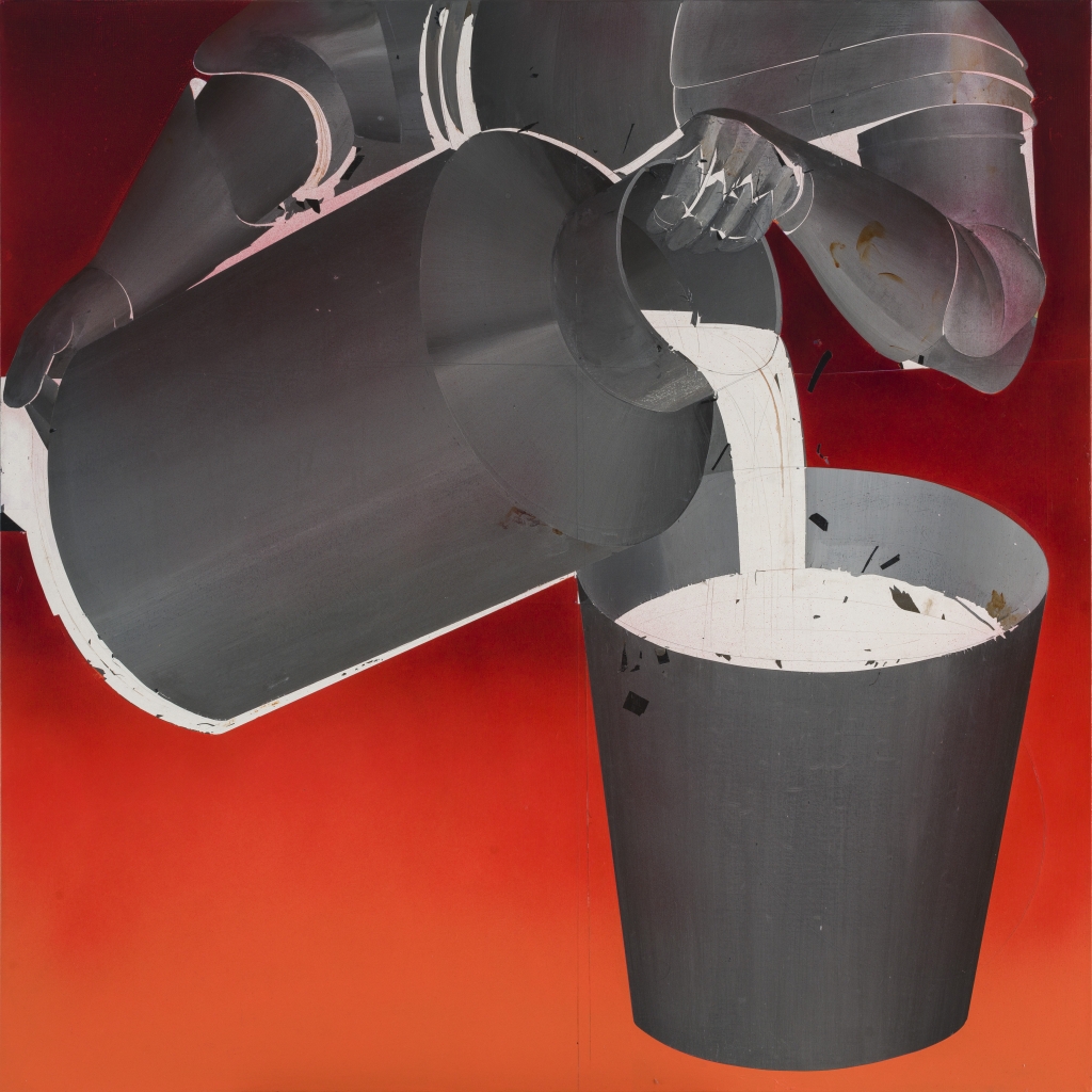
画面以强烈的俯视式近景组织一组彼此套接、倾斜和悬置的圆筒形构件。左侧一只横向伸展的大型深灰容器占据主要面积,其开口、侧壁与底部因透视压缩而形成沉重的斜向量感;右下方直立的杯状容器则以白色内腔承接一条由上方垂落的白色带状形体。上部数个卷曲、叠压的灰黑构件围绕中心聚拢,使画面既像静物的局部放大,也像机械管道在失衡瞬间构成的抽象结构。 红色背景并非均一平面:上部偏暗的酒红、下方渐趋橙红的色域,构成由压迫到扩散的空间气氛。灰、黑、白三种中性色在红底上被显著推前,深灰体块吸收光线,白色边缘和内壁则像切口般划开暗部。色彩在此不承担再现性,而直接服务于结构辨识:红色扩大构件之间的空隙,白色强调接口、内腔与轮廓,层层灰黑则使体积关系保持暧昧。 表面可见擦刷、覆盖、刮擦和边缘破损般的痕迹。灰色区域并不光滑,保留横竖交织的笔触、局部透出的浅层以及近似折痕、裂片的细碎线条;白色部分也带有不规则断裂和污迹。这些痕迹削弱了工业器物应有的标准化洁净感,使形体处于“被制造”与“被磨损”之间。若从视觉证据推断,创作并非单纯描绘圆筒,而是借助叠涂、遮盖、划刻及类似拼贴式的边界处理,让材料性本身参与塑形。 结构、色彩与工艺因此形成紧密的因果关系:构件越厚重、越向中心挤压,灰层便越深;连接处越脆弱,白色便越突出,细小的黑色碎片也越像脱落或切割后的残余。联系冷广敏作为综合材料艺术家的创作取向,这件图像可能体现了将日常形态转化为视觉结构的工作方法:对象不再以功能被阅读,而在重组、遮蔽与损耗中成为关于重量、容纳、流动和关系失衡的材料性现场。
Work 06
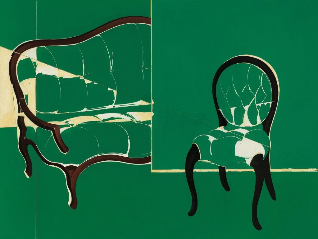
画面以大面积深绿色建立近乎封闭的平面场域,两把椅子被并置于其中:左侧椅子尺度较大,横向舒展,右侧椅子较小且更为直立。二者并非依照透视空间自然摆放,而是被一道垂直分界与数条细弱的水平、斜向线切割、连接,使物体、背景和类似墙角或台面的空间提示同时失去稳定性。左椅的轮廓向画面边缘延伸,具有压迫性的展开感;右椅则被孤立在较空的绿色区域中,形成观看上的停顿。家具作为日常、亲密且具有身体尺度的对象,在此被处理为不完整的结构残片。 深绿并非单纯背景,而是吞没大部分体积、阴影与空间细节的综合色面。乳白、淡黄的区域像椅面原有的亮部,也像被剥离、露出的底层;深褐与黑色则沿椅背、扶手、腿足构成强硬的边界。色彩因此不服务于写实明暗,而承担结构分层的任务:绿色使形体趋于平面,浅色将破损、断裂的位置凸显出来,深色轮廓则勉强维持家具可辨识的骨架。 椅面内部可见大量细长的裂纹、弧线和不规则断口,局部浅色呈现参差的边缘,显示画面或经由覆盖、刮除、切割、拼接等方式反复调整。尤其左侧椅子,椅背、坐面和扶手之间的颜色层彼此错位,仿佛形体不是被完整描绘,而是在材料层的显露与遮蔽中逐渐生成。右侧椅背内部的裂线则像表皮龟裂,也像一组无关节奏的线性书写,使“椅子”同时具有物件、图像和受损表面的多重性质。 这种处理将结构的脆弱感直接转化为视觉语言:精确而简化的外轮廓,与内部近乎偶发的裂隙、残缺相对抗;克制的综合色域,又与浅色断面带来的刺目感相互激发。结合冷广敏对日常形象进行拆解、压缩和材料化处理的倾向,这张图像的价值不在于再现家具,而在于让熟悉的使用物脱离功能叙事,成为时间、触觉、修补痕迹与心理距离共同构成的视觉现场。
Work 07
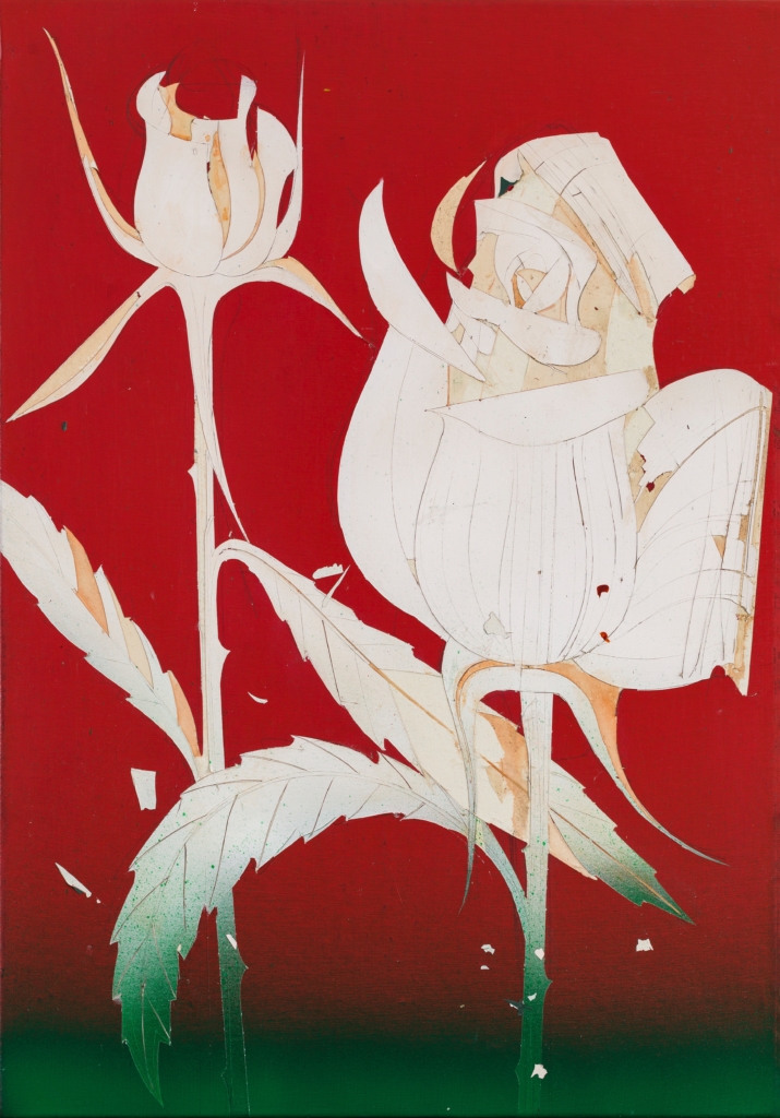
画面以大面积深红为底,两朵白色花形占据中央与右侧,左上方的花苞较为挺拔,右侧盛开的花朵则以斜向下坠的姿态扩张;二者由细长、弯折的茎杆和底部叶片连接,形成由左上、右中至左下的对角线运动。花朵并非依照自然写生塑造体积,而是被拆解为相互覆盖的弧形、尖角与带状轮廓。右侧花冠内部层层卷曲,花瓣的转折如同被切分、折叠的纸片;左侧花苞则保留更多向上收束的空白,使两种生长阶段在同一平面中彼此呼应。 红、白、绿构成画面的基本色彩秩序。高饱和的红色背景没有提供景深,却以强烈的视觉压力将浅色花朵推至前方;底端沉暗的绿色像一道低伏的地面,也使茎叶获得了暂时性的落脚点。白色并不均质,其中可见暖灰、米黄与淡褐色的渗入,局部又有偏冷的青绿色痕迹,因此花瓣既呈现出纸质般的轻薄,也带有经年磨损后的斑驳感。色彩在这里不是对自然光线的再现,而是服务于图像的平面分区与情绪张力。 花瓣、叶片和茎杆内部可见细密的勾线、划痕与不完全覆盖的色层,轮廓边缘亦保留了断裂、剥落和微小缺口。这些痕迹削弱了花卉题材原有的柔美与装饰性,使其更接近一种被反复加工、切割和沉积后的表面结构。尤其右侧花朵的白色区域,线条既像植物脉络,也像制作过程中留下的刻划路径;它们将平整色块重新打开,使观看在整体剪影与局部肌理之间往返。 结构、色彩与表面工艺共同形成一种矛盾的视觉经验:花的外形轻盈、舒展,内部却充满近乎硬质的分割与磨蚀;鲜明红底赋予画面强烈的装饰性,残缺和污点又不断抵消其完美。就冷广敏一贯重视图像提炼、平面秩序与手工表面张力的创作取向而言,此作并未把花当作抒情对象,而是将其转化为可被拆解、覆盖、刻写的视觉结构。植物由此成为检验材料感、线性节奏与图像记忆如何共存的媒介。
Work 08
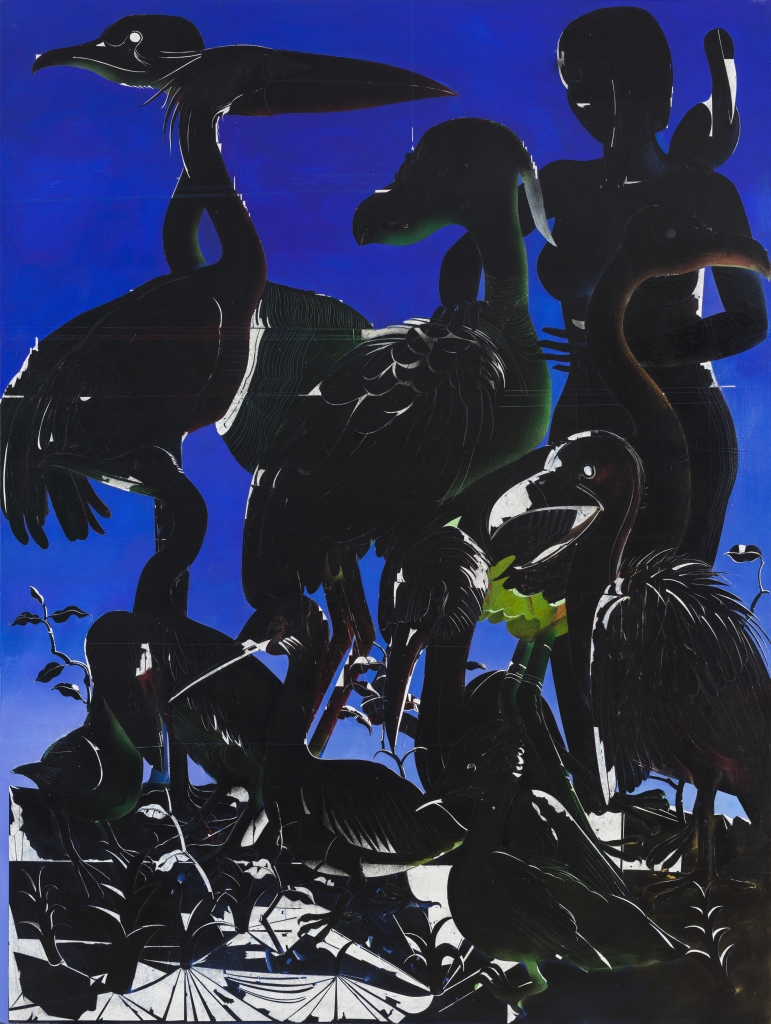
画面以近乎满幅的鸟群与人物构成垂直叠压的密集结构。左上方一只长喙大鸟以横向头部切入,细长颈部向下折转;中央较大的鸟体形成沉重的黑色体块;右侧直立人物与前景几只鸟的长颈、喙部彼此交错,使画面在上升、俯探、蜷伏和伸展之间维持复杂的节奏。底部草叶、枝梗与禽足构成碎裂而尖锐的网状地带,既承担空间基座,也将主体推向前方。人物右手上举的姿态并未导向叙事性的明确行动,反而与鸟类的静止凝视共同制造出近乎仪式化的停顿。 色彩关系极为克制。高饱和、深沉的蓝色铺陈为统一背景,既像夜幕,也像被压缩的平面空间;黑色形体则大面积覆盖其上,令动物、人物与植物在综合色块中紧密联结。局部从黑中浮出的幽绿、暗褐、灰白及极少量红色,并不用于写实塑形,而像潜伏于暗层中的光源或色层。尤其鸟颈、腹部和羽毛边缘的绿色晕染,使庞大的黑色轮廓避免沦为剪影,并赋予形体一种内部缓慢发光的生命感。 画面表面可见大量细密的刻划、扫线与弧形纹理。鸟羽并非以松散笔触逐根描写,而是由顺着躯体转折的平行线、短弧线和被保留的亮边组织出来;人物面部和躯干亦以极少的线性痕迹提示结构。这种在深色层中剥出浅色线痕、并让局部色彩从底层透现的处理,使形象同时具有平面装饰性与物质性的深度。白色高光尤其锋利,像被切开的边缘,强化了喙、翅、足及植物叶片的硬度。 结构、色彩和制作痕迹在此并非彼此分离:黑色首先承担剪影和重量,刻线继而在黑中建立羽毛、肌理与运动方向,蓝底则从形体缝隙中介入,成为压迫黑色群像的外部空间。就冷广敏的创作方法而言,这类图像可被理解为对具象母题的重新压缩:人物与禽鸟不服务于单一故事,而被置入精密的轮廓、层次和表面节律之中。作品的价值正在于它以看似静默的图像,调动了观看者对自然、身体、群体关系及幽暗生命力的感知。
Work 09
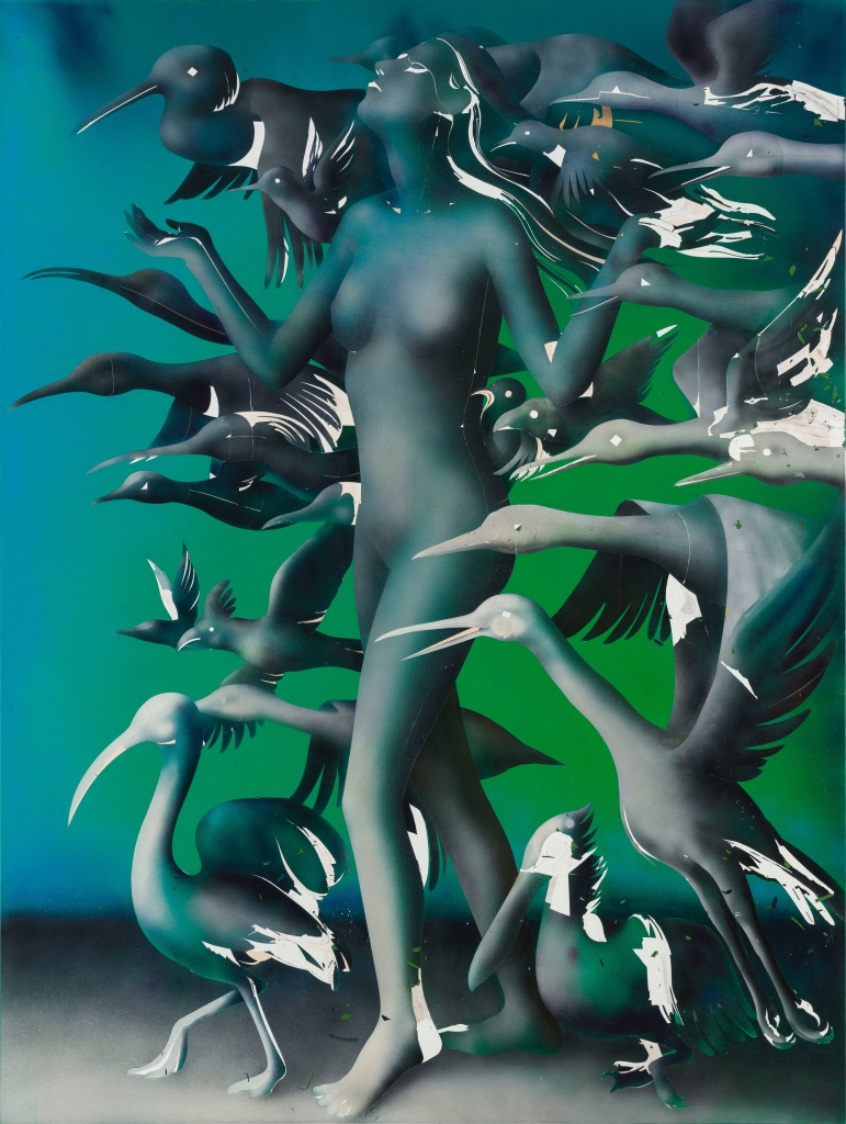
画面以一具直立的女性裸体为中轴,却并未采用稳定、庄严的人像构图。人物头部被上方密集的鸟群遮蔽,身体的完整性亦不断受到翅翼、喙部、长颈和爪足的切割;鸟类从左右两侧及前后层面穿插而来,形成一种向中心聚拢、又向外爆散的环流。人物微微张开的双臂与手掌,既像接纳鸟群,也像在无法摆脱的包围中维持平衡。前景数只大型涉禽以弯曲的颈部和锐长的喙部拉开纵深,鸟与人体之间的尺度关系被有意压缩,使自然形象不再是背景性点缀,而成为与人等量甚至更具侵入力的视觉主体。 背景由上部偏青蓝的冷色过渡至中段高饱和绿色,再沉入下部灰黑色地带,构成近似舞台幕布般的垂直色场。人体和鸟群主要由蓝灰、墨绿、深黑组织,其低明度轮廓从绿色中浮现,又在局部重新被暗色吞没。少量白色片段并非传统意义上的高光,而像被刮去、撕裂或覆盖后露出的不规则痕迹:它们散布于鸟翼、颈部、躯干与边缘处,使平滑的色面突然出现破损感。白色因而同时承担形体转折、羽毛纹理和表面创伤三种作用。 作品可见以柔化的渐层塑造体积的处理,人体腹部、胸部与腿部没有坚硬的解剖线,而是在雾状明暗中缓慢生成;与之相对,鸟喙、翼尖和爪部则常以锐利剪影推进。这种软硬并置使肉身显得脆弱、沉静,禽鸟则具备刀刃般的速度与穿透力。局部残缺的白色刮擦改变了鸟类羽翼原有的轻盈感,也令图像带有时间侵蚀或记忆剥落后的层积效果。 从冷广敏持续关注生命形态、观看秩序与图像心理张力的方法来看,此处并非单纯描绘人与鸟的共处。鸟群的重复、变形和遮蔽,令人物从一个可被明确辨认的主体转化为被多重生命力量包围的场域。色彩的冷冽、结构的拥塞与表面的破碎共同削弱叙事的确定性,使观看停留在亲近与威胁、抚慰与侵扰、装饰性与异样感相互纠缠的状态。
Work 10
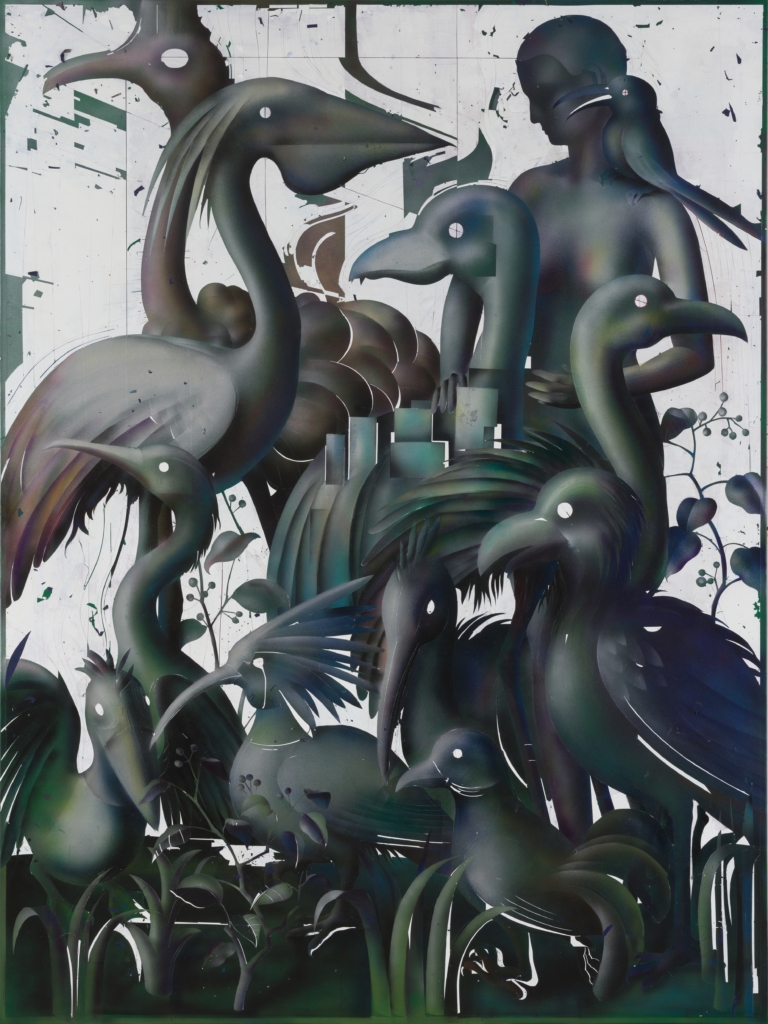
画面以密集叠压的鸟类形象构成近乎无空隙的垂直场域。数只长喙、长颈或冠羽突出的鸟由前至后交错,头部朝向彼此错开,形成视线、喙部与颈部曲线不断穿插的网络。上方较大的鸟体以挺立的姿态占据主体,中部横向伸出的喙和半圆形羽片将空间切分;下部则由低伏、回首或俯冲的鸟群与植物状线条填满。形象虽然可辨,却没有被置于自然叙事之中,而更像被压缩在同一平面上的符号群落。 色彩集中于深墨绿、蓝黑、灰白和局部紫褐,冷暗色的连续过渡使鸟体获得近似金属、橡胶或釉面般的幽微光泽。白色底层并未承担纯粹背景功能,其上保留的大面积划线、断裂色块、飞溅痕迹与局部露白,反而像一层受损的墙面或被反复覆盖的图像基底。深色形体因此既从白底中凸显,又时时被刮擦和缺口侵入,稳定的轮廓与破碎的表皮之间形成张力。 从视觉证据看,画面可能综合使用了喷涂、遮挡、描绘及刮擦式处理。鸟的躯干依靠柔和渐层塑造体积,边缘却常以锐利、近乎剪影化的线条收束;羽毛则被处理为成束的尖长笔触或弧形切片。若干圆形留白点位于头部或身体内部,既可被观看为眼睛、孔洞,也像图像被穿透后的空白节点。背景中近似建筑轮廓的直线与块面,又同有机的颈部、羽毛和枝叶形成几何秩序与生命形态的并置。 这类处理使形象不止于鸟类再现:色彩的低饱和与表面的磨损感削弱了禽鸟通常的装饰性,密集构图则将个体转化为相互遮蔽、彼此依存的结构单元。结合冷广敏作品中常见的图像重构倾向,此作可被理解为通过动物母题、图形化轮廓与材料性痕迹,讨论生命图像如何在覆盖、删减与叠加中被重新组织。其价值正在于让具象识别、平面设计感与绘画表皮同时发生,而不将任何一者固定为唯一观看方式。